1) LOCATION
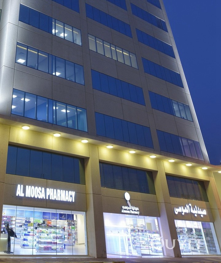
Most of the time outpatient pharmacies are adjacent to the hospital lobby, a prime spot near the entrance that contributes to sending a powerful brand message. Sometimes you can only access the pharmacy by passing by the lobby and so the door becomes a focal point.
Because of this, the 1st impression is of utmost importance. To maintain the visual flow from the lobby to the pharmacy it needs a neat look with matching materials and colors. Strong communication is also vital.
The outpatient pharmacy is part of the hospital entrance and cannot be accessed from outside. As it can only be accessed from the inside it must be welcoming and immediately offer assistance and care.
The result should be a beautiful, inviting, and easy-to-navigate atmosphere where you can immediately find the services offered within the pharmacy as well as the logo, right by the door. Better still when there's a smiling pharmacist that welcomes patients and guides them to the right consultation counter or to the line.
2) EXPERIENCE
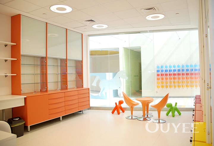
It's very important to have a clear idea of the experience that people should have inside a hospital pharmacy. Usually they are patients or their friends and relatives. In any case we are dealing with people who are potentially in pain, upset or stressed out. This is why improving the pharmacy experience is vital. The pharmacy needs to be a welcoming place that erases negative feelings by providing a natural environment with relaxing colors and materials. Tones of blue and green with a splash of vibrant yellows or oranges together with the use of wood, stones and other natural materials, natural images, plants, moss or small trees can really relax people’s minds and create a stress-free place. Together with this relaxing atmosphere (the opposite of retail pharmacies) we can create a complete health care experience. We want to inform, embrace and take the best care of our patients. We want to make them feel at home, welcome and comfortable enough to ask questions. Let's not forget that waiting time is stressful for everybody and especially if you are waiting for something related to your health. It's also very important to develop ways to use the space to promote a health care message, it needs to be instructive and comforting. The experiential message needs to be two-fold:
· Care
· Stress free
And you can only reach this by using good quality design and materials, it's about how much you love your patients.
The result will leave an "afterglow effect".
This is what a 5 star hospital pharmacy should be.
3) WAITING AREAS
The potential of the waiting area is often hugely underestimated yet it must not be overlooked. Average waiting time (depending from country to country) is between 15 and 45 minutes, so what do people do in all this time? When we talk about retail pharmacy the goal is to push clients to surf around and shop but when we're in an outpatient pharmacy this is more of a challenge. This is why it is important to create islands. Each island needs to contain a macro category (for example diabetics) and should be manned by a specialized pharmacist, a small consultation spot, or if possible a room where a specialist can be on rotation once a week. This will also function to advertise the hospital services that relatives and patients are unaware of.
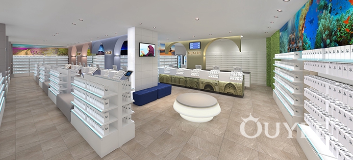
One idea would be to create an island as a waiting area but what we really should be going for is something more like a comfortable lounge area and not something that feels like a bus stop! Wave goodbye to uncomfortable chairs and instead welcome people in to a small lounge with mobile rechargeable accessories and information screens alternating relaxing videos with the queue order. Seats need to be comfortable and made from durable materials, a little heavier so they are less likely to be moved around and some of them need to be armchairs so that the elderly can stand up more easily. The design, colors and materials should all be in line with the new concept.
Sometimes it is good to differentiate waiting areas if the intention is to create a VIP quick service. VIP lounges are usually small, intimate, and divided from the rest of the pharmacy. They are created with sophisticated materials and lampshades, even better when connected to top brand beauty and skincare displays.
4) PRESCRIPTION & CONSULTATION
A well structured hospital pharmacy needs to have 2 different categories of counters:
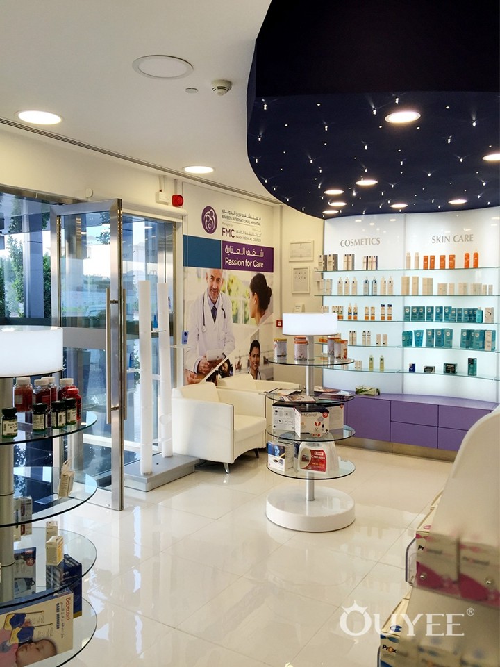
- One for advised retail products: always with the presence of a specialized pharmacist that offers advice for each category of product. The counter is smaller and easily recognizable as the cash counter. An idea is to insert an image, logo or health care message in the body of the counter.
If the hospital pharmacy has an automation system, you can deliver even the most expensive products to the counter as well as other medicines to free up the counters during peak times.
- The prescriptions counter: this is where we want to enhance our professionalism and confidentiality in the relationship between pharmacist and customer. These counters must have a privacy panel. We certainly want the relationship between the two to be solidified and maintained over time, so that patients feel free to ask for therapies and to get the best possible answers accompanied with a smile. Both will be seated one in front of the other with no barriers. All the technology utilities will have their own spaces so the pharmacist’s work will be easier and quicker.
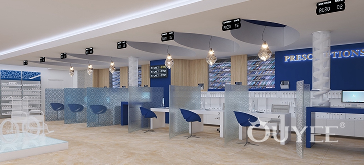
5) FRONT END
For the outpatient pharmacy, the front end is important because it is like the business card. The layout needs to have some curves to lead the patient in a soft and gentle way from one side to the other. What needs to emerge is not the mass of products or offers, but the right products. There will undoubtedly be those who will want to do it themselves, so ease of reaching products is important, but it is much more important to feel cared for and advised, which is why there will always be support points, as for example tops or monobrand gondolas to stop people opening a product and encouraging them to get advice.
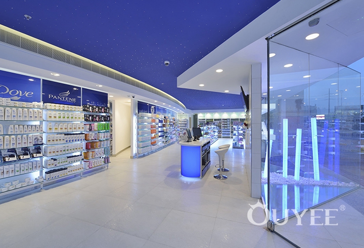
The front end needs to be impressive. It should add something special and creative, something natural like trees or plants, and not just product displays!
Therefore a good study of the category and adequate exposure becomes really essential, just like in the retail world. Just look at the mess of scattered or un-priced products on the floor. The study of the right category and visual merchandising should be immediately included in the front end layout. A good front end starts from outside the parking lot or from the corridor from where the pharmacy opens. The windows must be inviting but not closed, full of light and promises. We want to show the activities of the pharmacy and immediately clarify our logo and what services and products we offer.
We create a promise of health, let us fulfill it.
Let's update the new vision for the hospital pharmacy, let's transform it into something really unique that helps people smile and feel better!
For more information, please contact us by steve@ouyeedisplay.com, or call the 24-hour hotline: +86 13826419811

