At Ouyee Display, we take inspiration and ideas for retail space planning from every element of design — from playing The Sims gaming software to researching the best site design strategies. One such great strategy to implement in your optical retail store is to be sure there is enough “white space”, a concept that web designers are all too familiar with.
“Whitespace, many times referred to as negative space, is the portion of a page left unmarked, the portion that is left blank, or the empty space in a page. In web design terms, it’s the space between graphics, columns, images, text, margins and other elements.”
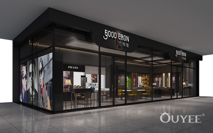
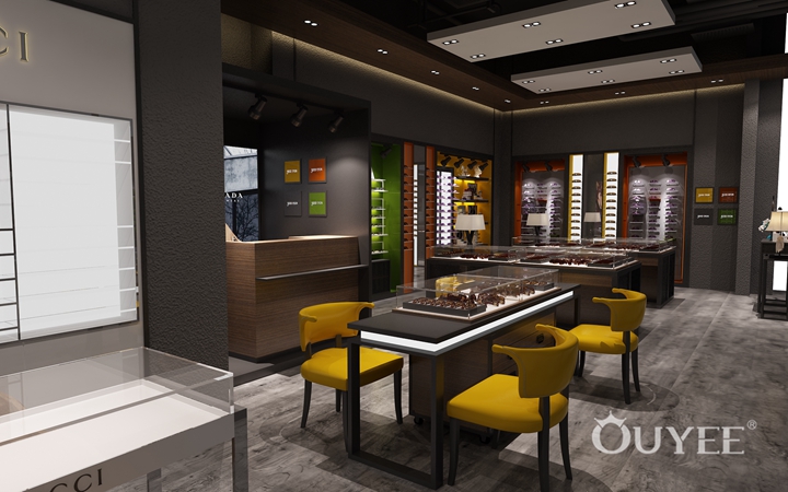
Essentially, too little white space means that you can’t get your site visitors to focus on the elements of the site that you would want to them to hone in on. In a similar fashion, your optical retail store needs “white space”, space for people to be able to process what your store has to offer. On the other hand if you have too much white space you’re missing out on selling opportunities. It is a delicate balance. Focus in on this principle by decluttering select areas of your store, namely around visual merchandising areas, your point of sale area and throughout 2-3 other parts of your optical retail shop.
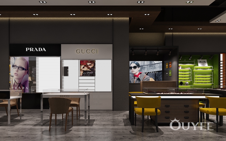
No one wants to shop in a store stuck in the 90s or early 2000s. At the end of the day, your outdated optical retail store will impede on your customers’ shopping experience as a whole. Despite your best efforts to provide great customer service or expertise in optometry, your interior will have a major impact on your patients’ perception of the quality of your practice.
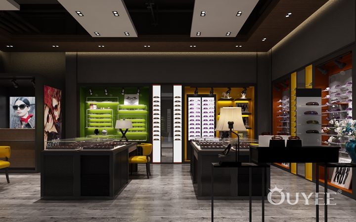
Unfortunately, outdated displays, unkempt work surfaces, and run down reception areas detract from the desired impression of professional competence and fashionable appearance. An investment toward the interior of your practice will have almost immediate returns in higher average sales and patients referring their friends to visit your optical practice. Ouyee display offers optical furniture for every style. Their most popular collections include the DW Collection, Trend Collection and Vail Collection. Don’t lose customers because your optical space is stuck in the past.
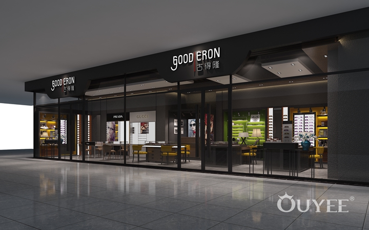
Keeping your walls clean is another important way to make your optical retail store presentable. No one wants to enter a store that has chocolate stains and scruff marks covering every inch. Also, never be afraid of an accent wall. If you do decide to use an accent wall, don’t miss the opportunity to sell-sell-sell in that area! Accent walls pull the eye toward their direction, so use accent walls minimally, but also strategically.
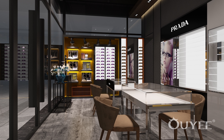
Bonus: While giving your walls some TLC, it may be a good time to consider utilizing the vertical real estate you have available to maximize space in your store. Always look for ways to incorporate signage, posters, displays and even shelves of various levels at a higher plain of your store to engage customers in new ways. This little trick will make your space seem bigger than it is.
Did any of these ideas work for you? If so contact us — we would love to hear from you and even feature you on our blog!
For more information, please contact us by steve@ouyeedisplay.com, or call the 24-hour hotline: +86 13826419811

