If you think eyeglasses stores are fated to be boring and uninspiring, think again. An optometry store in San Francisco is determined to prove that, if you’re coming in to get your glasses, you should also have something worth seeing.
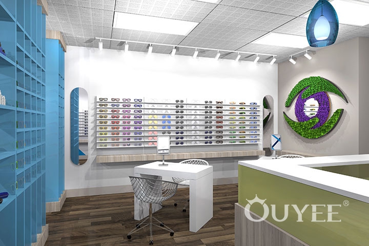
For this eyeglasses store interior, we played with a blue and green color palette, set on a background of soft neutrals and spiced up with a dash of muted gold shades. This led to a space that is at the same time invigorating and calming, with bright tones entertaining the eye and cold colors relaxing the mind
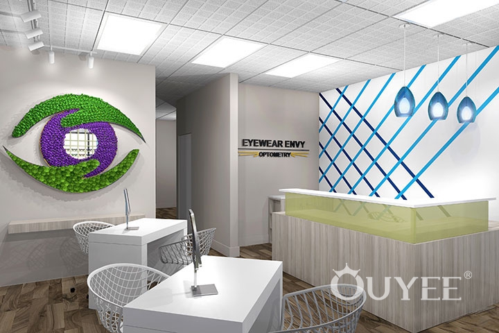
Taking a step further from the usual wall-shelving displays, we placed part of the eyeglasses on double-entry open shelves that also function as space dividers. The choice of blue – the chromatic symbol of clarity – as a background for the eyewear is not accidental.
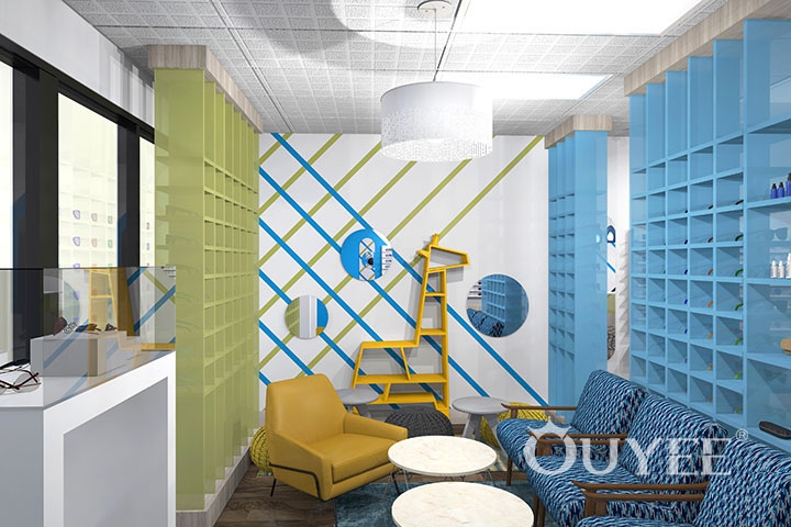
We extended the blue to the geometric wall graphics, to part of the chairs and to the floor treatment in the waiting area, creating a good balance between bright colors and muted neutrals. The additional green shades, whether vibrant as in the ingenious eye-shaped wall mirror or mixed with yellow tinges, added an extra layer of visual comfort.
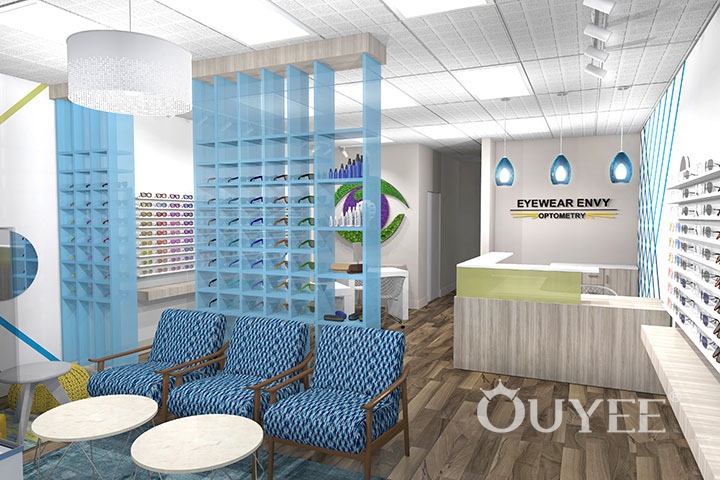
Alternating between solid colors and geometric patterns was part of our effort to keep the space engaging and fun. While color was important, we allowed for large areas of white to give the eye a chance to rest. We did this trough the use of wall paint, white counters, and white ceiling tile for extra luminosity. We also used white tables and white light fixtures.
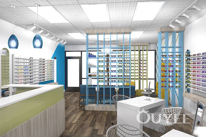
Since we tried to create an eyeglasses store interior with an easygoing vibe, we kept the materials simple. A combination of polar white and gray plastic laminate for shelving, and modern, streamlined furniture kept the place clean-looking and informal. We brought in variation through textures, by mixing fabric-covered chairs with acrylic-framed ones and combining the softness of carpeting with the hard look of ceiling tile.
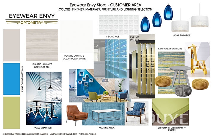
We varied the look of the light fixtures, combining glass pendants, drum shades and spotlights strategically focused on the display shelves. Since eyeglasses stores are usually small, we made the most of the available square footage by using modern furniture and opting in some areas for cut-out pieces with mid-century designs.
A small corner of the store’s waiting area was designed for children. We furnished it with soft poufs, round tables, a multicolored rug and an adorable giraffe-shaped shelving unit that added some extra color to the whole chromatic combination. We tied it all together with the striped geometric pattern that we used behind the main counter, but with a bit more contrast.
Finally, we created the store’s logo and provided our client with the colors and fonts we used, in case new branding materials are needed.
For more information, please contact us by steve@ouyeedisplay.com, or call the 24-hour hotline: +86 13826419811

