A new flagship store in Sydney was developed for selling the latest cosmetics, skincare products and beauty supplements from Japan, Korea and Taiwan. With a few stores already running in Sydney, This cosmetics shop approached us to develop a larger store concept to showcase a broader range of imported Asian beauty products. With quite limited time to design and document the concept, the designer deliberately chose a simple palette of concrete, whitewashed plywood and herringbone flooring.
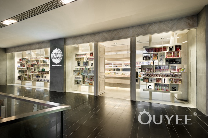
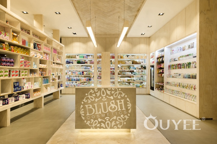
Based on a simple and modern concept, the store uses pure-color wood as the main material, with warm and soft tones to create a simple and warm atmosphere. Some geometric elements, such as the the walls, vertical surfaces of the shop, geometric display space, the layered alcove on the wall and the linear chandelier on the ceiling, make the store's decoration looks neat , mixed but not confused. The quaint decor makes the cosmetics store even more distinctive. The cosmetics store is decorated with yellow as the main decoration style, which greatly show the luxury atmosphere of the store. The indoor structure with clear lines is extremely simple and neat.
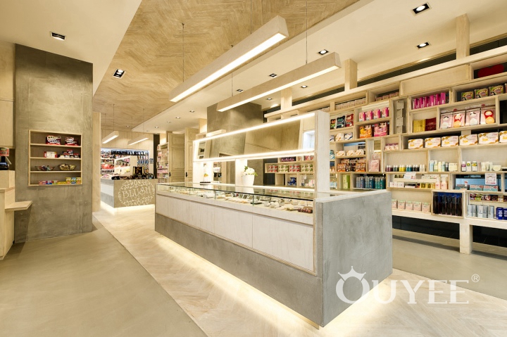
A basic shelving format with plenty of storage for extra stock was developed, integrating plenty of LED strip illumination for product display. Adjustable mirrors with edge lighting to reduce facial shadows on customers when testing make-up, as well as custom pendant lighting over the mid floor benches. The store commands a wide shopfront to the entire mall, so the designer maximized this store with full height glazing and a custom double sided box display cabinet, along with full height custom designed doors with distressed paint effects. A small treatment room at the back of the store introduces an additional beauty service not provided in their other stores, which allows customers to try before buying.
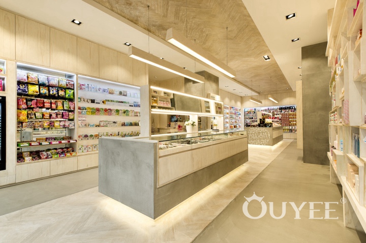
The simple and practical wooden display rack are placed with products fully. LED lights are added on the edge of the showcase to allow customers to view the details of products much more clearly. The bottom of the wooden cosmetics counter is also equipped with LED lights. The soft lights are scattered from the bottom of the counters, looks hazy, just like the fog, adding more to the cosmetics store's mystery.
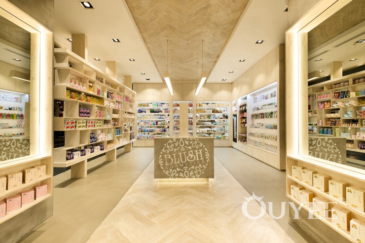
The wooden display stand is divided into a number of small areas to display the cosmetics into categories, which makes it easier for customers to choose. The transparent glass window allows customers to see the products displayed from the outside, while also ensuring the indoor lighting effect. The spacious interior space can also allow more products to be displayed in front of consumers.
For more information, please contact us by steve@ouyeedisplay.com, or call the 24-hour hotline: +86 13826419811

