The retail goal for phone store was to create an environment for customers to experience the various mobile and electronic offerings. The design needed to reflect and show the product line by using streamline architectural details, clean surfaces and an accent of futuristic style. The storefront played a large part in showcasing brands and their products. In the storefront design, the designers display the brand name and its main products by using eye-catching elements. With a large entrance opening and low iron glass window display glazing the interior of the store becomes a part of the storefront elevation.The solid surface side wall and upper bulkhead invites and subliminally guides the mall patrons into the store to experience the electronic products.
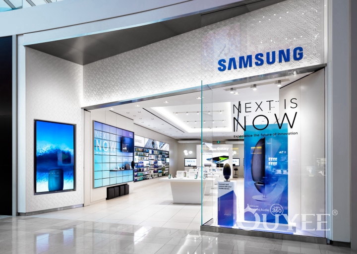
The form of the store creates influential visuals from any angles of the mall corridor. The up-lighting grazes and highlights the embossed solid surfaces along the upper bulkhead facade. These embossed panels are tilted inward and move down into the entrance side with continuous motion and incorporate an impressive 95 "Large Face Display (LFD).
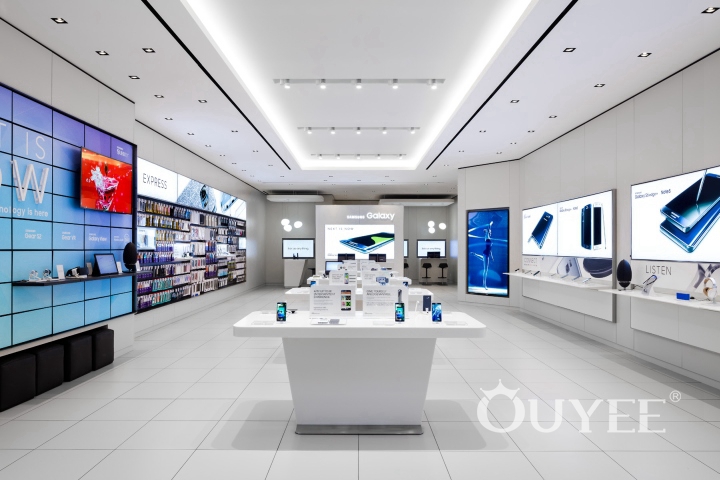
The elements used in the storefront are also repeated internally. Angled lines are reflected in the central display stand, trading desk and customer service station. Most display surfaces are constructed from the same product to maintain continuity. The brushed stainless steel frame of the storefront and interior perimeter display add the futuristic style for the store.
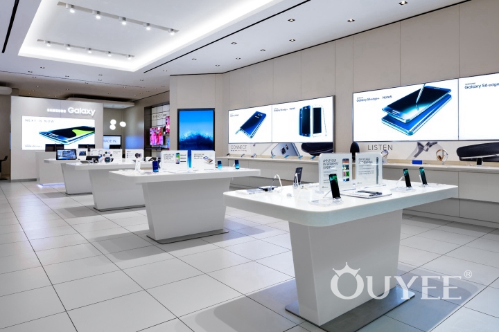
Designers want to keep the material palette simple, clean, and stylish to reflect the design philosophy as well as showing the products. The color scheme stays in bright white, cool grey and a touch of warm white. Bright white tones are used for all Staron solid surfaces, and the wall panels and ceilings are finished to highlight various destination points inside and outside the store. The surrounding walls are finished in warmer white to better accentuate the brushed stainless steel frame display. The floor maintains a simple matt cold grey large format tile for a clean building platform.
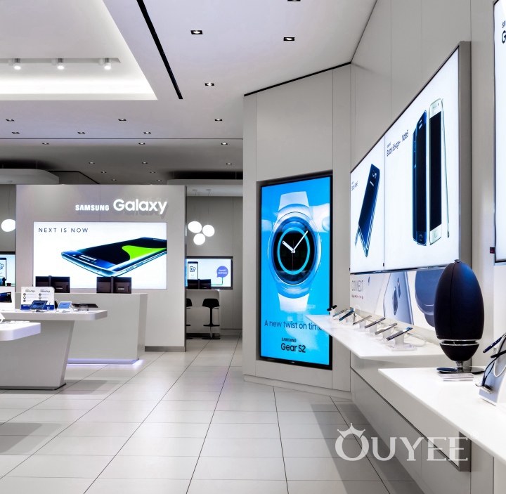
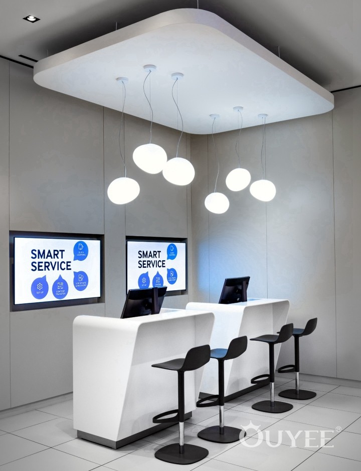
Backward, customers are greeted by a trading desk and custom service stations, an additional point of contact for customized service and product knowledge. These are designed with beveled lines to balance and repeat the design elements of the storefront.
For more information, please contact us by steve@ouyeedisplay.com, or call the 24-hour hotline: +86 13826419811

