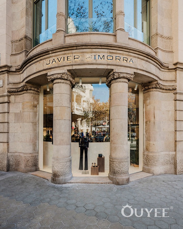
After the Interior Design Guidelines for fashion designer Javier Simorra, the brand opened a store on the famous Passeig de Gracia in celebration of its 40th birthday. Located right in front of Casa Mila, one of the emblematic modernist buildings by the hand of Antoni Gaudí, a new element came into play, turning the design of the venue into a symbolic answer to its surroundings.
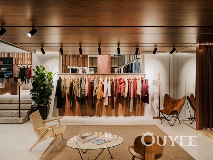
Architecture is never an autonomous element but rather one which always belongs to the site where it is built. With Casa Mila on the other side of the pavement of the concept store, a dialogue between the two buildings became inevitable, and was translated by incorporating materials of Casa Mila onto the new Simorra store.
Exterior view
Retail space elements
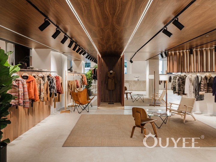
Designer used limestone, similar to Casa Mila’s curved facade material, and black iron for all store finishings made out of metal. These referenced to Casa Mila ́s balconies, innovative in their function as a spine across the entire Gaudí building, and, when combined with the Javier Simorra walnut, create a symbiosis between two very distinct materials.
Interior overview
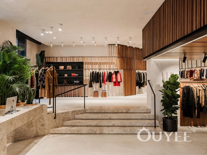
The design is combined with the Javier Simorra walnut
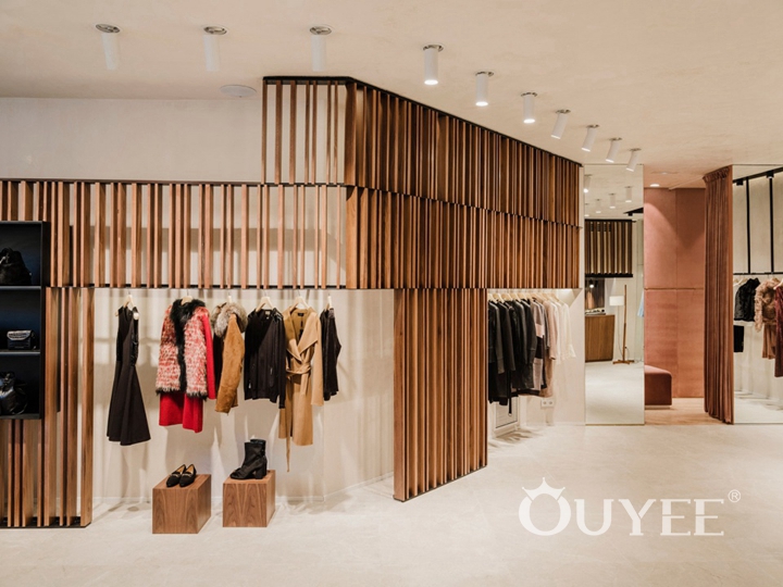
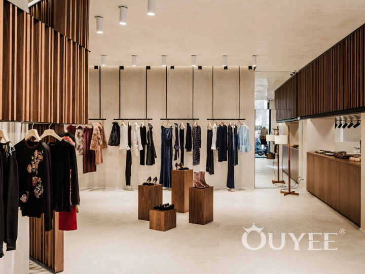
A symbiosis between two very distinct materials
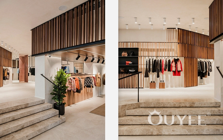
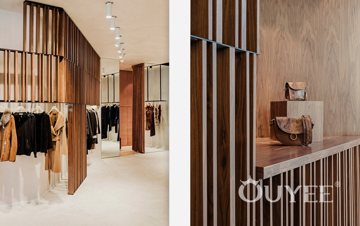
Display area detailed view and furnishing detailed view
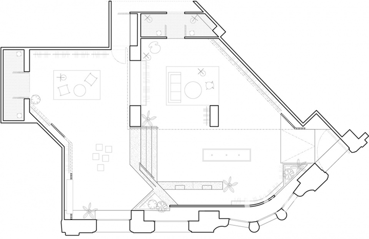
Plan
For more information, please contact us by steve@ouyeedisplay.com, or call the 24-hour hotline: +86 13826419811

