There are many types of retail stores, and the spatial pattern is varied. It seems difficult to find a regular spatial segmentation. In fact, it is just the result of a combination of three spatial combinations. Therefore, a appropriate layout of retail stores should be reasonable, smooth, and guided.
The cold color and stereotyped design is the impression that we can feel from most optical shops. In fact, the optical shop can also do emotional, temperature, and can be small and fresh! Then, what kind of store display can bring pleasure to consumers? Let's take a look at this minimal optical store.
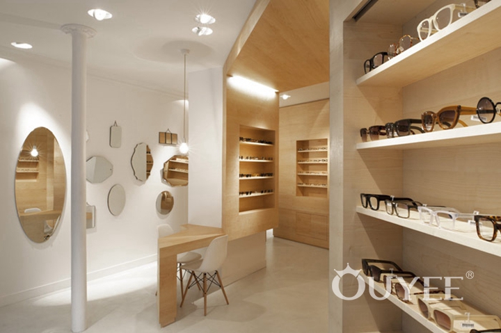
Designer use white and wood color, and abandon the messy and fancy decoration to make the whole space look clean and bright. So that customer's main attention can always focus on the glasses and try to use them. It is pretty important for a place which are selling optical.
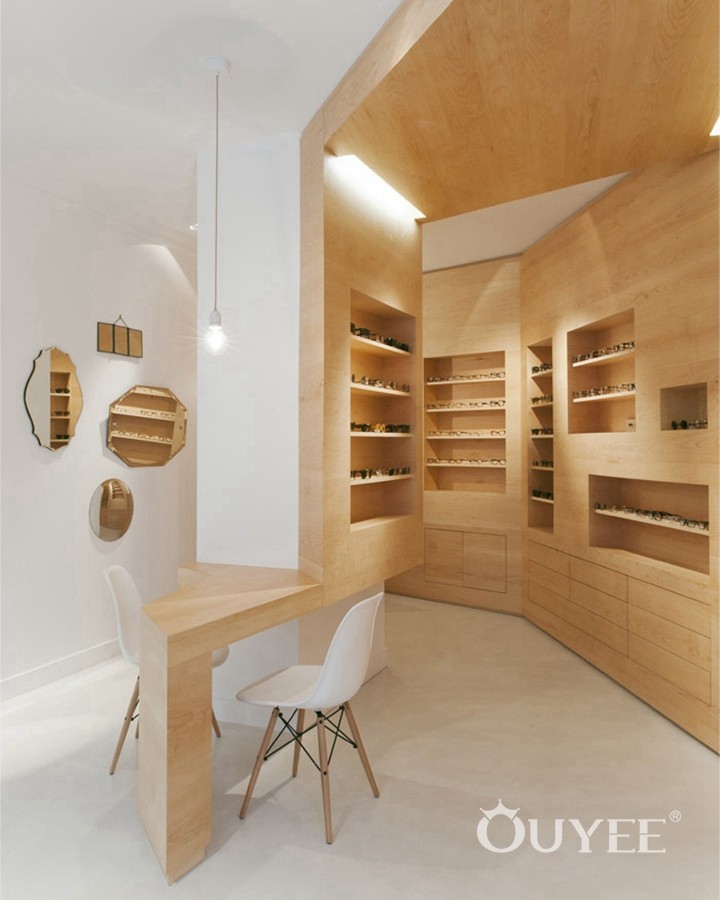
The store was formerly a gallery, and converted into an modern eye-wear store. the concept of this project is to describe the newer space as an echo of the former, also exhibited and highlighted glasses as if they were artwork.
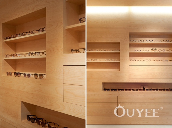
This interior, with its wood-lined walls and recessed shelving, incredibly appropriate to display the glasses as though they were works of art in an exhibit. It just indefinitely increases their perceived value.
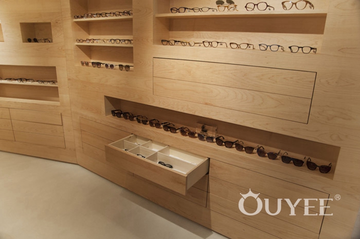
A glass showcase designed with light wood. It extends and follows the curve of the wall to create an eye-catching setting from the shop window.
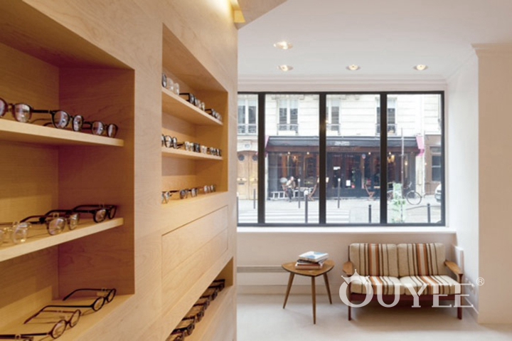
In order to maximize space use, a sloping wall was fitted with wood optical display cabinet according to undulating folds. Meanwhile it create a rough and refined space for whole shop.
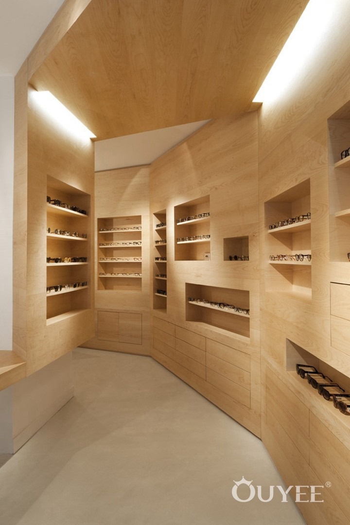
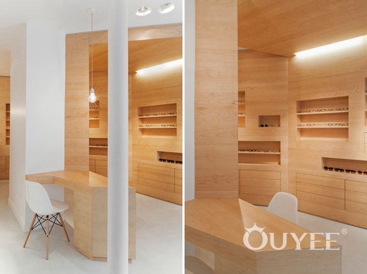
Other side, the center's pillars were transformed into a counter display panel and table for discussion or rest. This kind of space organization can help to guide people back in the store, and arouse the customers curiosity to explore other area.
Different antique-style mirrors are hung on the other wall, it allowing consumers to try on glasses easily.
Please contact us freely if there is any project problem we can help. We will be very pleasure to service you with our professional ideas.
For more information, please contact us by steve@ouyeedisplay.com, or call the 24-hour hotline: +86 13826419811

