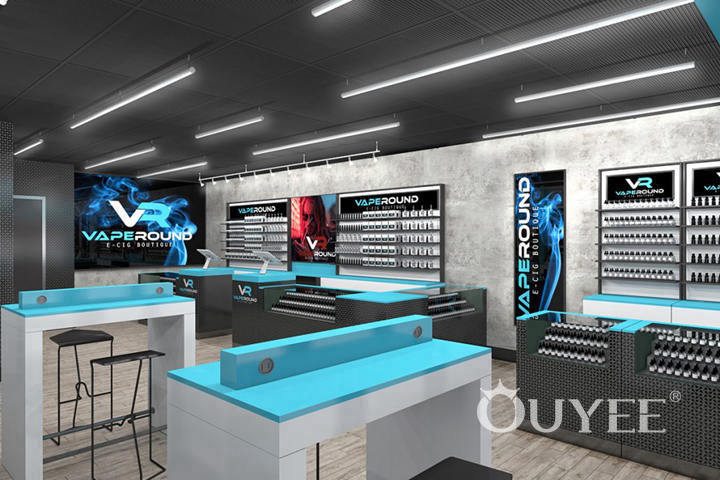
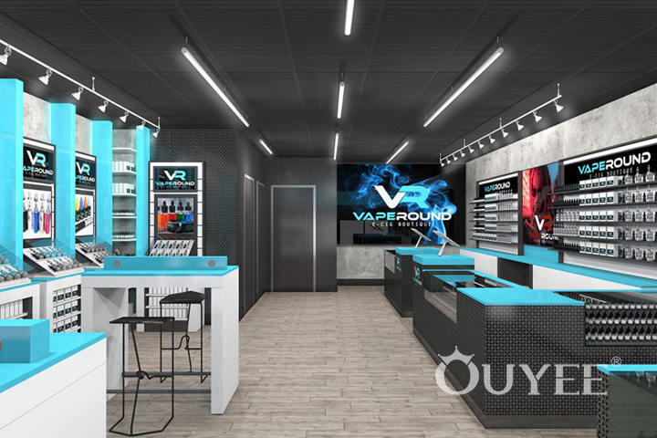
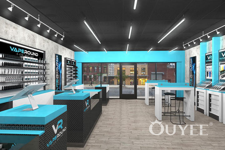
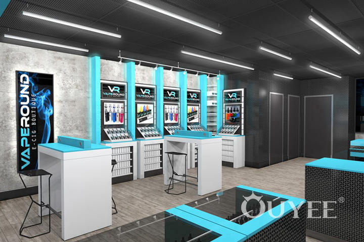
For the Vape Round shop in Canada, one of our new store designs, we envisioned a modern space, closer to one fit for a technology retailer. That meant clean lines, yet plenty of display cases and shelves, plus a well-organized vape shop design and well-thought layout that would allow the customers to easily slide from one display case to another and get the information they need

We wanted to create a mix of modern and intimate, so we chose tones of black and gray to balance each other in the design of the shop. This created a crisp look, yet one that suggests relaxation and a rather cozy feeling. It also allowed the products to become the visual focus.

In order to draw attention to the products, we kept the variations in the furniture to a minimum. Between gray shelves on one side and black glass display cases with a simple tone-on tone pattern on the other, there is enough variety of lines to please the eye yet keep the focus on the products. In addition, directional lights are used to draw attention to the shelves. The ceiling lights are placed in the direction of the traffic, making the space look larger.
Against this black-and-gray background, perfect for envisioning the pleasant ascending of the vapors, turquoise is the only color that we used for contrast. This allowed us to create clear dividers between shelves, to pinpoint the areas where information can be found, and to give the eye the visual contrast it craves. It also made the store logo, displayed in strategic areas, pop.

Besides the aesthetic considerations of this vape shop design, our main purpose was to create a space where information is easily accessible, where traffic is easy and pleasant, and where the products speak for themselves. The visually efficient splash of contrasting color allows the eye to immediately grasp the way that the layout is meant to serve the customers’ purposes, while the tasteful modern lines and crisp look speak of a store that takes every detail into account.

For more information, please contact us by steve@ouyeedisplay.com, or call the 24-hour hotline: +86 13826419811

