Before you ever think about opening a coffee shop or any other business, you need to design it. Consider colors and decorative elements that enhance the coffee house motif. for a small square meters shop, how to fully use the limited space is play a important role in the whole project.
With just 65 square meters to play with, it's shop design have to created a space that would draw passersby in, but also offer solo visitors room to relax. In this cases, designers paired wood panelling with perforated metal inside this tiny coffee shop, which also features a combined bookshelf and staircase.
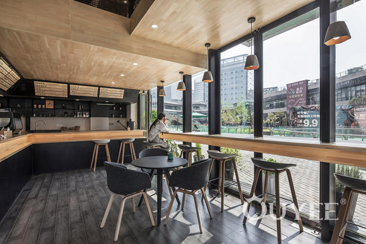
To achieve this, designers chose to focus on materials that would either add warmth, or allow light to pass through. This resulted in a palette of wooden panelling and metal mesh, as well as upholstered furniture and green plants.
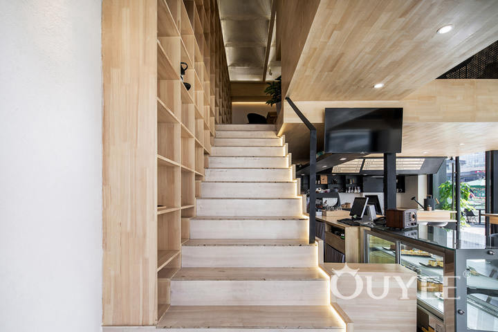
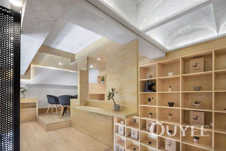
A set of grid-like wooden shelves covers an entire wall that stretches from the ground to first floor, displaying plants and coffee products. A staircase extends out from this shelving unit, helping to make efficient use of the space.
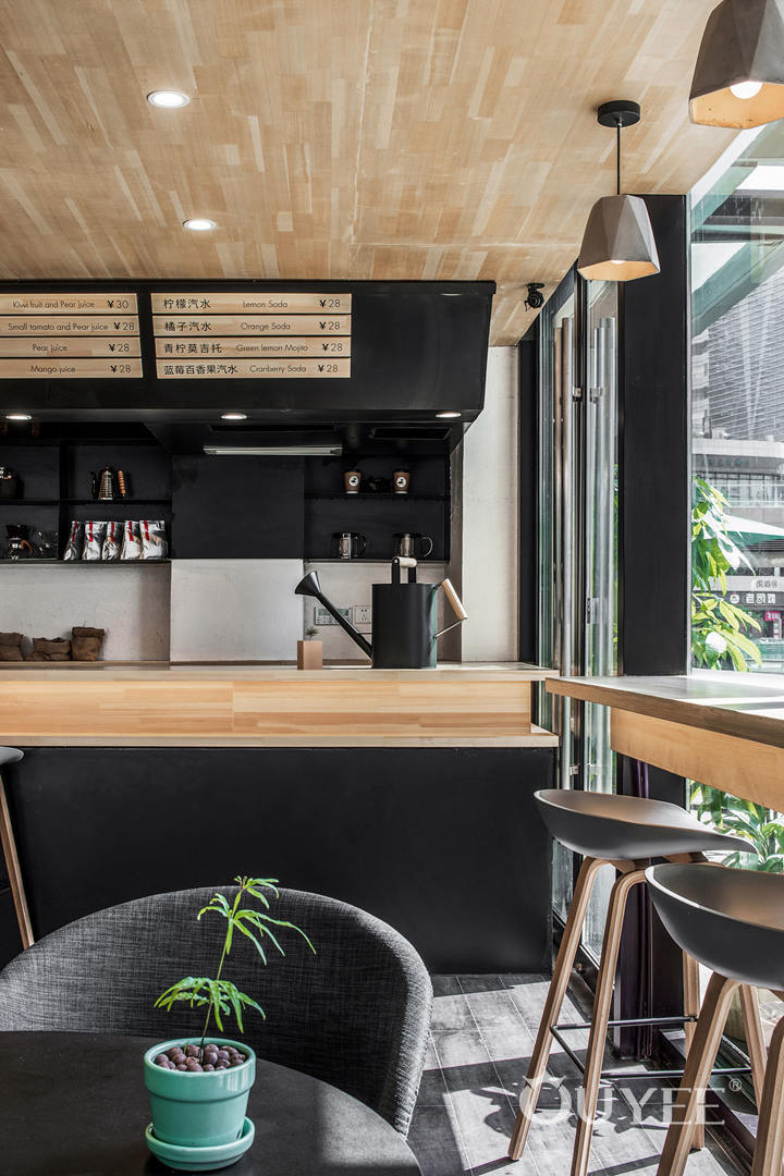
Downstairs, the studios installed a serving counter with light timber details, including a menu displayed on matching strips of wood. There is also a seating area that runs alongside the windows, allowing visitors to look out onto a nearby square.
The wood is repeated in the ceiling, and contrasted with darker floorboards. The designers chose a restrained colour palette, with mainly greys and whites used for the shop furniture.
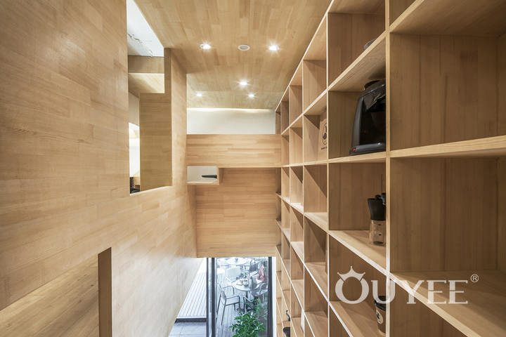
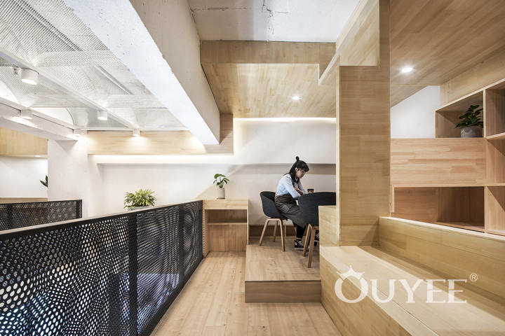
Although the ground floor is flooded in natural light, the upstairs part of the shop has no windows, so the studios used "the integration of material and light" to keep it as bright as possible.
Panels of punched metal divide the space, introducing privacy without obstructing the light.
The panelling is repeated overhead, in a series of arched screens that create a scalloped effect on the ceiling. Sections of wood have also been used to create corner spaces, with cut-out sections acting as "windows".
For more information, please contact us by steve@ouyeedisplay.com, or call the 24-hour hotline: +86 13826419811

