Our clients were aware of all possible complications, that is why they decided to contact our headquarters to design their new Pharmacy.
Ouyee devoted to the profession, managing a rural pharmacy in the Campania Region. On that occasion Ouyee decided to entrust the project to a local company, which proved to be not able to realize a Pharmacy up to our expectations. Now, the Pharmacy Director and partner wanted a unique and different Pharmacy: Ouyee Pharmacy.
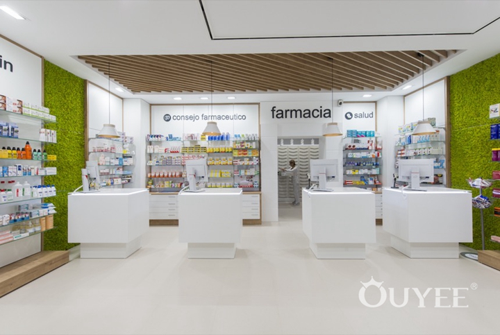
The two pharmacists had in mind a very clear idea of how their new pharmacy should be.They wanted to create a reference point for Health & Wellness, a pharmacy where they can put their expertise and professionalism at the service of their customers. They wanted to create a HEALTH CENTER PHARMACY.
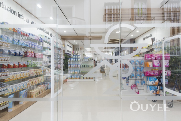
The Layout design
Since the first meeting with our team took place, the level of understanding was total. The new format created by Ouyee to implement services in pharmacies, was just what the doctors were looking for. They have strived for becoming a local landmark and giving back to pharmacists a leading role in Healthcare up to make their wish come true.
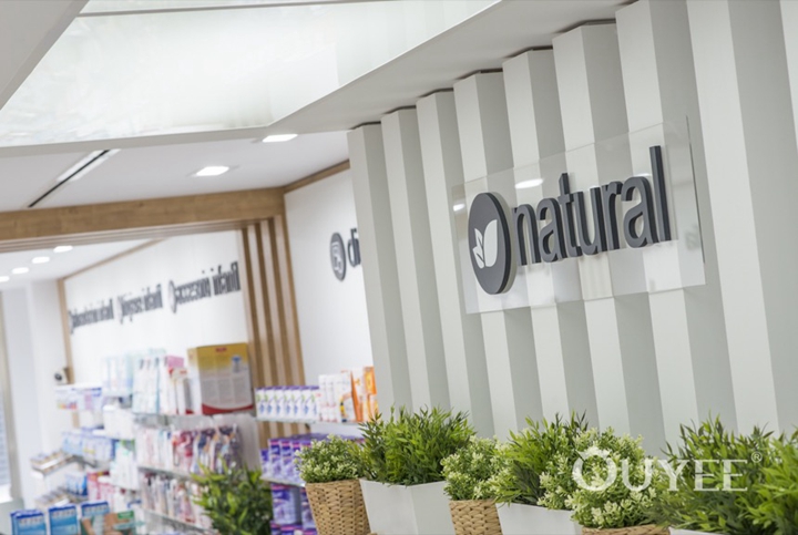
A location like the one available, long, narrow and with only one shop window, did not make the layout design easier. But our experts managed to organize the space at best, optimizing every square meter to ensure the greatest SKU exposure. All this without forgetting the space needed for services and the operating areas.
The communication project
From start to finish, the two partners trusted us completely. From the layout design to the communication, passing through the services offer and the visual merchandising, NOTHING WAS LEFT TO CHANCE.
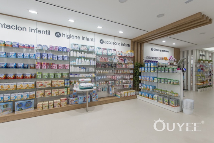
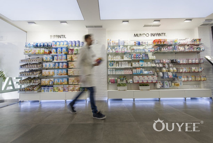
Although the place is long, narrow and with little natural light, the Pharmacy looks bright and welcoming and communicates effectively its offer of products and services. The backlit visuals of our displays have a double function: they communicate the Pharmacy’s Brand image and product category.
The logo design and interior communication revolve around the magnolia flower, to emphasize the identity of the Pharmacy. The color palette and pictures reinforce the Brand image and create a pleasant and relaxing environment.
In a HEALTH CENTER the services offered to patients are the most important part. And in Le Magnolie Pharmacy, the service rooms are at the center and can be seen from every point of the sales area, even from the shop window. Self-analysis and Medical Spa services for prevention and health care are the “heart” of the Pharmacy.
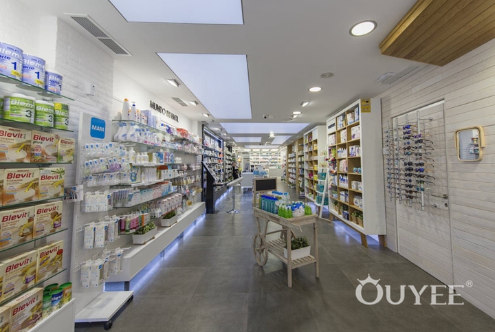
THE RESULT:
§ A beautiful and welcoming Pharmacy that communicates its offer of products and services in an effective way;
§ A professional Pharmacy different from its competitors;
§ A new reference point for the community, where people can go looking for specialized health advice;
§ An innovative Pharmacy that grows every day, with more than 200 receipts per day, already from the first week.
For more information, please contact us by steve@ouyeedisplay.com, or call the 24-hour hotline: +86 13826419811

