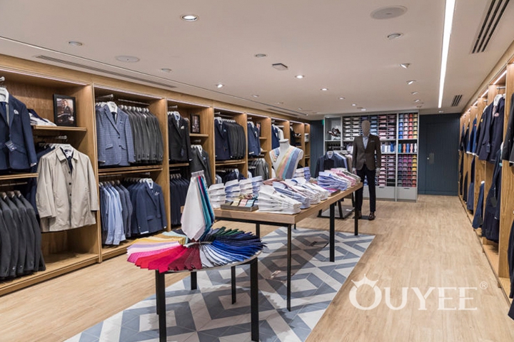
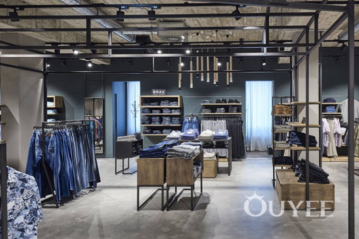
About 1,100 square metres surface and three stories complement the five-floored main building with its four levels full of fashion, a drug store and a daytime bar, as well as two floors of the middle building. The modern, newly-constructed volume adapts itself to the present buildings as well as the urban landscape and offers significantly enlarged space for men and women’s wear. blocher partners created the architectural concept as well as the interior design. On the inside, a material mix convinces through setting finely adjusted contrasts. Ceilings made of exposed concrete, walls with noble oak wood panels and a designed screed having etched patterns, become a harmonious unity together with relicts of the historical city wall which were visibly incorporated over two floors. The rooms are clearly structured and offer simple orientation to the visitor. In the centre of the building, a staircase can be found between an air space extended over three floors. Visual connections between different levels motivate shoppers to aspire to the higher floors. Suspended industrial lights with their own funky charm in the interplay with modern materials are the eye-catching devices.

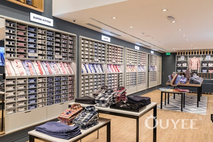
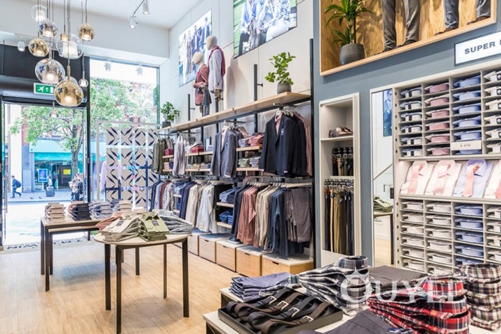
Diversely arranged surfaces give costumers room to explore: Curated isles with seat possibilities and room-in-room systems structure the single levels. Tables, shelves, cubes, parallel bars, poles –the team of blocher partners designed varied possibilities to present fashion.

Nonetheless, the different levels vary in style: Fashion for modern women can be found on the ground floor. Bright wood combined with white metal – a minimalistic design with Scandinavian impression – displays the appropriate background to address a younger target group. On the first floor, the premium sales area for women showcases an opulent design: Exquisite curtains, rosé tones, glazed and high-end oak wood, shelf systems made of brass, floors with ornamental decoration, a style lounge with colour consultation or VIP shopping. This ambience is created for the costumer with high expectations. The third floor is dedicated to men’s wear. Designers created a used-look matching male aesthetics. Old wood, dark metal or wire baskets have time to shine. All three floors have one thing in common: creating an authentic ambience in which clients come to stay. That can be achieved through combination of materials and a playful, varied furniture thus making shopping a pleasant experience.

Lined with an abundance of prestigious boutiques, Munich‘s golden mile is the ultimate playground for the power shopper, and thanks to an ongoing influx of coveted names from fashion’s upper echelon, it continues to define itself as Germany‘s top destination for retail therapy. We’re obviously talking Maximilianstrasse, one of the four main thoroughfares in the heart of the city and synonymous to luxury shopping across the country and beyond. It’s nowhere else but here that fashion house Dior has opened the doors of its newest outpost. Occupying two floors of a late 19th-century building by German architect Friedrich Bürklein, the store features an interior design by New York City-based architect and longtime collaborator Peter Marino.

Interestingly, the design sees the presentation of womenswear and menswear in a single décor, a novelty in Dior‘s global retail network. Plush yet homey, both sections are captured by luxurious custom-made furnishings and fixtures, and to heighten the sense of luxury they’re interspersed with additional unique pieces by French designers such as Philippe Hiquily, Maria Pergay and Pierre Paulin, in addition to curated range of contemporary artworks by Ugo Rondinone, Tarik Kiswanson and Martin Kline. The new Dior boutique carries the brand’s full range of women’s and men’s collections.

For more information, please contact us by steve@ouyeedisplay.com, or call the 24-hour hotline: +86 13826419811

