The Poiray Jewelry Store’s Simple yet Sophisticated Interior Design.

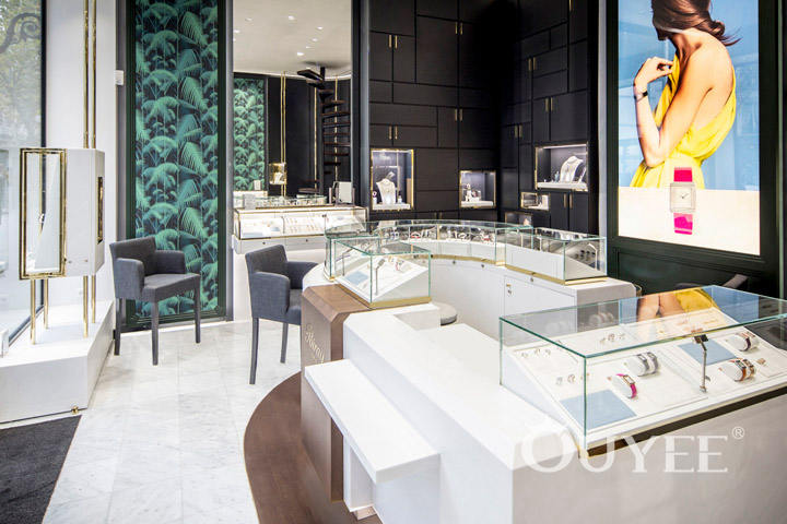
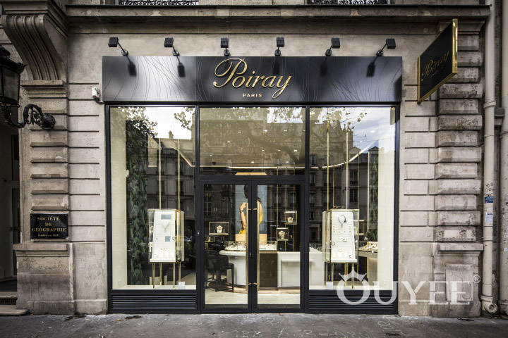
The interior design of this Place Vendome store has a bold, fresh look. This boutique, under new management, features an inviting entrance area that brings the Paris boutiques of old to mind. Once shoppers step inside the doors, they’ll be treated to a unique mixture of old and new with sophisticated colors and materials.

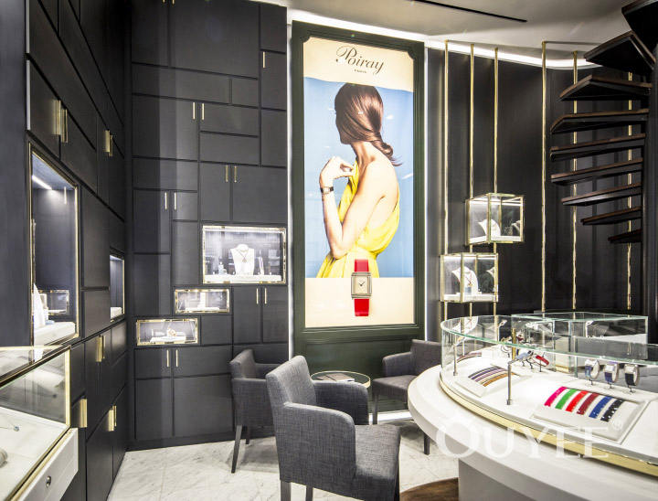
The new layout, comparable to the layout of modern upscale stores, fully draws shoppers into the experience. The contrast between the black walls, white counters and brass details attracts shoppers’ attention to the watches. Comfortable gray chairs allow shoppers to spend time easily browsing the bracelet and watch selections.

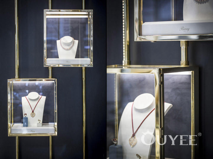
The work of a skilled interior designer is obvious in the display areas. In addition to counter displays, wall displays of different sizes nicely showcase the store’s necklaces. All of these displays utilize lighting in ways that highlight the jewelry, without overwhelming it. The store’s walls are designed specifically to help showcase the designs in the showcases without taking away from them in any way. Suspended displays help maximize the space inside the store.

One of the things that stands out the most in the store design is the section of wall that highlights the designs. Shoppers browsing the store will find that their attention is drawn to the designs featured on the wall art. One of the features that truly stands out in the boutique is a circular staircase that reaches the ceiling. The overall effect inside the store is one of sophistication, blending tested jewelry display methods with the latest ideas in modern design.
For more information, please contact us by steve@ouyeedisplay.com, or call the 24-hour hotline: +86 13826419811

