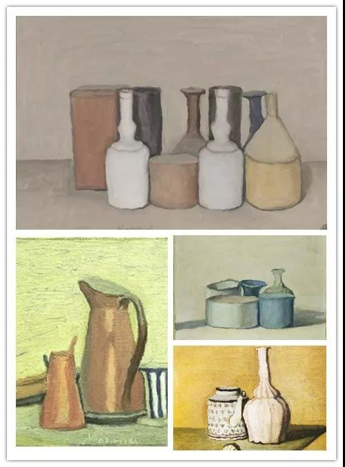
“Morandi color palettes”are named after Italian famous painter Giorgio Morandi, which is recognized as the “most relaxing color combination in the world”. The colors looks like being covered with a layer of gauze, gentle and soft in a subtle tone, trending in recent years to apply in decoration of high class residences.
What if bringing Morandi colors into kitchen design? FADIOR designers here to present you with surprises.
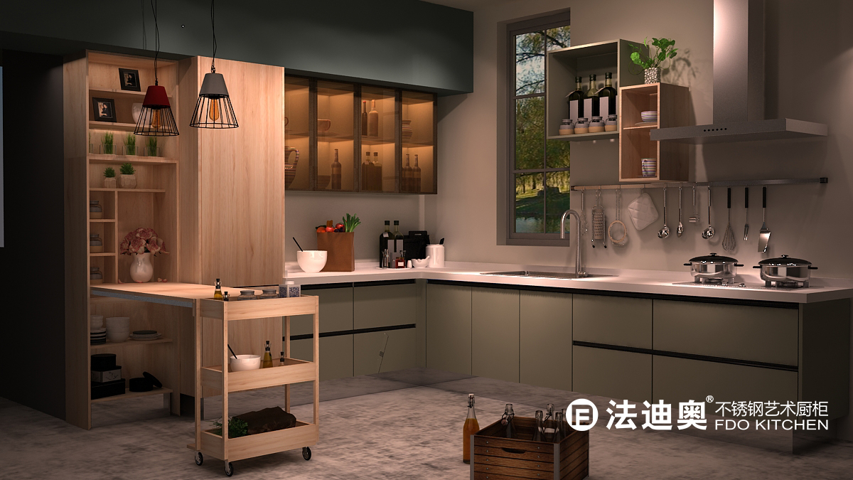
Bean Grey - X014
Mixture of energetic green with calm grey makes you feel like in a beautiful grassland enjoying breeze of spring, all fresh with elegance. Proper application of wooden grain cabinet bringing warmness just like sunshine.
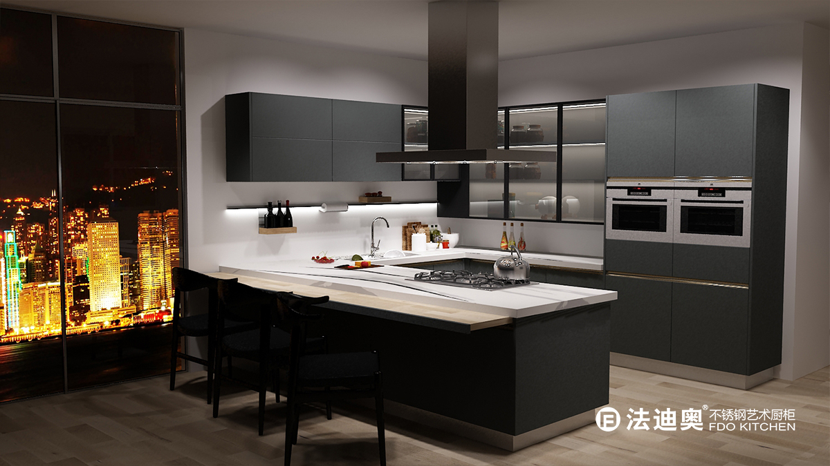
Foggy Blue - X012
We would compare impression of this design to a decent gentleman sitting and drinking coffee by the window with mysterious silence. It is a unique beauty with distance, yet it makes you unforgettable.
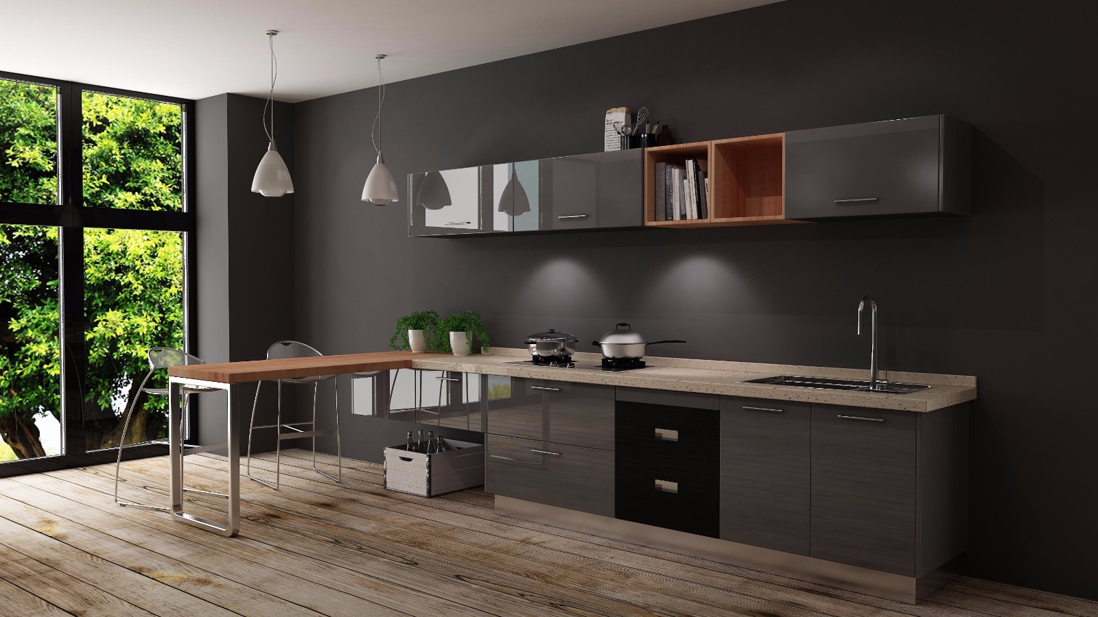
High Ash - Z011
High-grade gray and orange wood grain are creatively combined for a conflict of calmness and enthusiasm. As if the magma under the rock, the power of accumulation suddenly burst into the senses, but also brings you excitement and freshness.
The popularity of Morandi colors represents people’s calling for peaceful and relaxing family life. As leader of high end stainless steel kitchen system, FADIOR never stops its steps in introducing new designs with elegance and simplicity for our valued customers.


